If every light cue is an attention-grabbing extravaganza, you will very quickly fail to grab much attention at all.
Please Remember:
The opinions expressed are mine only. These opinions do not necessarily reflect anybody else’s opinions. I do not own, operate, manage, or represent any band, venue, or company that I talk about, unless explicitly noted.

I realized last week that I’ve been neglecting the “Lighting Strategies” category on this site. So – here’s an article for the lighting techs among us. The squints. Lampies. LDs (Lighting Designers/ Directors). You know.
…and I’m including myself in the “lighting human” group, because I currently run both audio and lighting for the shows that I do. I rather enjoy it, actually.
Anyway.
The older I get, the more I realize that art is primarily a game of contrasts.
In music, you create flow and interest within a song (or instrumental) by having passages that differ from one another. You create tension and release by adding a bit of dissonance in one area, and then letting that “clash” turn to harmony a touch later. You may punctuate a legato (smooth and connected) section with a phrase or two of staccato (sharp and detached) notes.
In audio, the same thing is true. If you’ve got two guitars to mix, it’s very helpful if one of them emphasizes a different frequency range. If the kick drum is going to be the low-frequency foundation at 50 – 100 Hz, then the bass guitar should probably live in the 100 – 300 Hz range. Overall, an audio tech needs to leave themselves some headroom, or else there will be nowhere to go when things need to get bigger.
What’s funny is that music and audio humans often talk about contrast in terms of “light and shade.” In doing so, they directly invoke the language used to talk about lighting. An LD creates different looks by incorporating a range of colors and intensities into their light cues. They might start with a “cool” wash, and then accent certain areas with “warm” colors. Some parts of the stage might be in shadow, whereas down-center might be as bright as high-noon.
The Volume War
Contrast is a huge piece of making great art, so it’s shocking that it will often go on the chopping block. The “volume wars” are a perfect example.
In a somewhat misguided attempt to make their recordings stand out, bands/ producers/ mastering engineers/ A&R humans decided that they needed to be “louder than the last guy.” There was just one little problem: They couldn’t raise the maximum peak volume of their delivery mediums, or the output devices that people were listening on. To get around this problem, heavier and heavier limiting was used.
As a result, the average level of their music was raised – but because they couldn’t also raise the peak level, the volume contrasts within the songs (at both the “macro” and “micro” levels) were greatly reduced. People started saying that music sounded “flat,” or too-loud, or tiring. The diminished contrast meant that people’s brains started to interpret the music as something more akin to noise – and tuned it out.
Here’s the thing.
Lighting humans are not immune to the volume war.
I admit, I don’t see many shows that aren’t the ones I’m working on. However, every so often, I will catch an example of a light design that has fallen victim to the all-too-common notion that “If it’s super-intense all the time, that means that it’s exciting all the time!”
Nope.
I’ve had bands bring light shows into venues, and when mistakes have been made, they’ve almost exclusively been made in the “being loud all the time” category. You’ve probably seen several examples of what I’m talking about.
- Different colors are flashing constantly, driven by the beat.
- You get the impression that the LD had an unrequited love for strobe lights earlier in life.
- You get the impression that the LD has just discovered what the “bump” buttons do, and has set out to put as many miles on those buttons as is possible.
- You get the impression that the LD is gravely concerned that just hearing the kick drum is not enough. Every kick hit must be punctuated by a lighting event of some kind.
- The movers are constantly flipping around, cycling their color gels and gobos.
- The blinders are used every few seconds.
Here’s what I’m betting happened after a short while: You started to unconsciously “filter” the light show. Sure, you continued to be aware of it, but because it was “loud” all the time, it turned into nothing more than a bunch of visual noise. Without contrast, nothing can actually get any attention – all attentiveness gets spread out equally.
You know what’s beautiful, though?
The solution is easy. The way that you fix this is to hold back. “Do less stuff.” Turn the “volume” down.
Better Results Through Doing Less
Seriously, how often have you ever been able to solve a problem by working less hard?
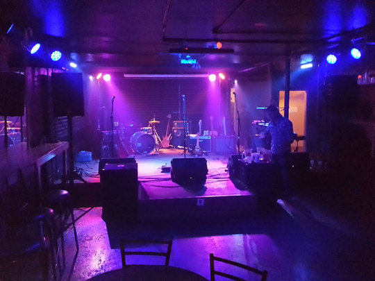
I’m not always perfect in using contrast with lighting, but I think I can give a good, object example by how I light a Stonefed show. Every so often, I’m privileged to be able to work with these guys. Stonefed is a funk, jam, blues, and soul outfit from Moab. They have honed their craft to a razor point. When they play a show, it’s the ultimate party. Killer rhythm section + fun guitar work = massive win.
The temptation, then, is to run animated light cues all night long. Chases. Flashing stuff. Lots of excitement.
But that would actually end up being less fun than what really works.
On a Stonefed night, I try to stay basic as much as I can. I try to get varied looks with “static” cues, and only call one or two per song. I try to call only a small amount of attention to the lights.
And then, they play “Take Me To The River.”
I actually have an animated cue named that, because I always call it when Stonefed plays the tune.
“Take Me To The River” is an animated cue where the front light alternates between blue and green, and the other fixtures light up in sequence, all in blue colors. The overall effect is meant to be a sort of “underwater” look.
In my opinion, calling that cue feels much more like a major event, because it wasn’t preceded by a bunch of other, animated cues. For some shows, I’ve felt that the cue made the song stand out more, because the whole feel of the show was – suddenly, and very tangibly – different.
After that song is over, it’s back to the static cues. Again, we’ve got to have contrast with what just happened.
And then…DRUM SOLO! As Ed Stone gets cookin’ I get out all the flashy, animated, strobing cues that I’ve been saving up. I do have to remember to keep things varied, though. If I have one cue roll all the time, it just gets filtered out by people’s brains. If I just keep a strobe hammering away, it ceases to be fun and simply becomes annoying. If the drum solo is long, I need to remember to call and hold some static cues every so often, so that the animations will become interesting again.
The different feel of the lights also punctuates the different feel of the drum solo – but the lights wouldn’t feel different if I’d been going “full tilt” since the first song.
When the end of the show comes, and if I get the opportunity, I have a “roto-strobe” cue that flashes the lights around the stage in a chase. Once again, it only works as an “exclamation point” at the end of the show’s “sentence” if the lights have been relatively static beforehand.
Of course, this is just talking about the overall visual style of a show. The “macro” interpretation. There are very good reasons to have contrast in your cues, at an internal or “micro” level. Also, at a technical practicality level.
To illustrate, I’ll pose a question:
If you’re like me, and you love using haze to make light beams show up, in what situations will those light beams be the most striking?
A) With lots of other lights involved, which are at high-intensity?
Or…
B) When other lights are at a lower intensity than the “beam” lights?
Think about it.
Contrast.
Also, to provide an example of a well-constructed set of light cues, I’ve included this video of The Australian Pink Floyd Show playing “Comfortably Numb.” Yes, the light show does do some very huge things – but notice how the “super crazy lighting explosion” is limited to the end of the song.
(…and this isn’t even – in my opinion – the best version of the lighting for this song. If you can find the PBS special that these guys did, make sure to watch it. The lighting for “Comfortably Numb” at that show was even better.)